Graphic Design | Adelaide, South Australia
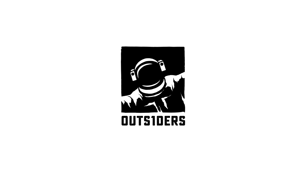
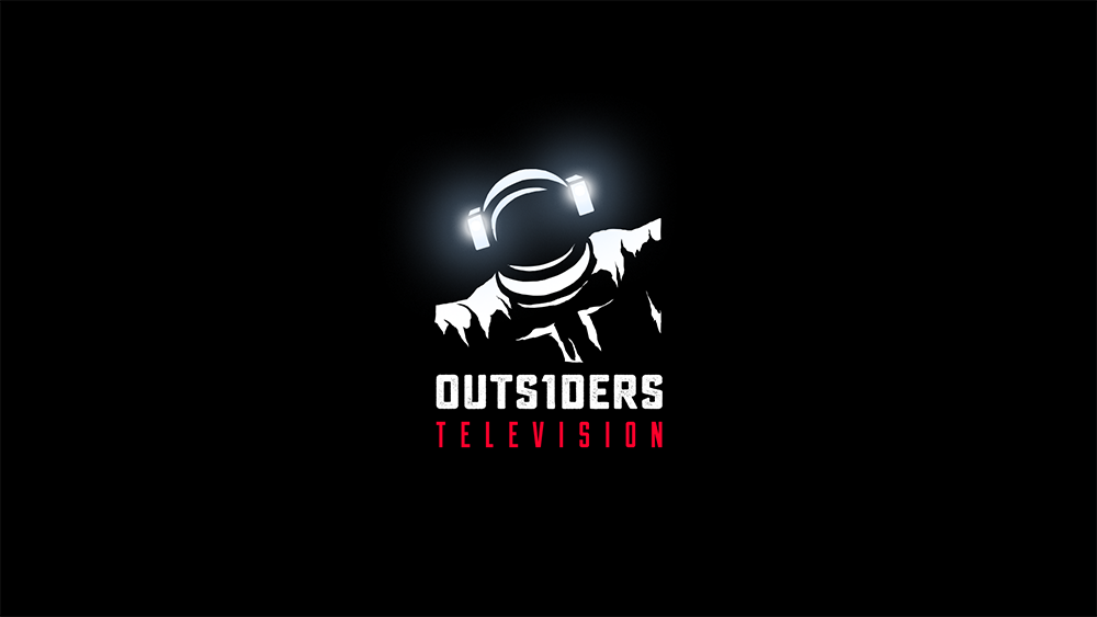
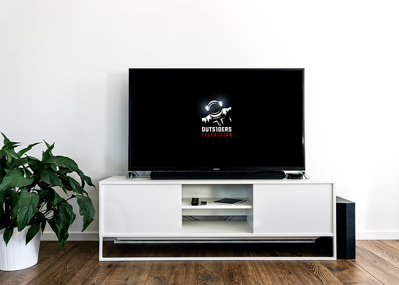
Logo design for Don Handfield and Richard Rayner (The Rift, Knightfall). The initial logo is a stark black and white icon of a front-facing astronaut, arms reaching beyond the perimeter of the brand's blackness. The logo preserves its white/black balance and is not inverted when applied to dark backgrounds. For television and other screen contexts, an embellished version of the logo was produced for The History Channel's Knightfall that adds illuminations to the astronauts helmet lamps, and a bold red identifier.
Deliverables: logo suite, style guide
Client: OUTS1DERS (2016)
Tags: Branding, Illustration